Family English Center aims for simplicity in brand identity design. Along with that, using the red color has a lot of special meanings.
Project Information
Client: Family English Center
Year: Updating
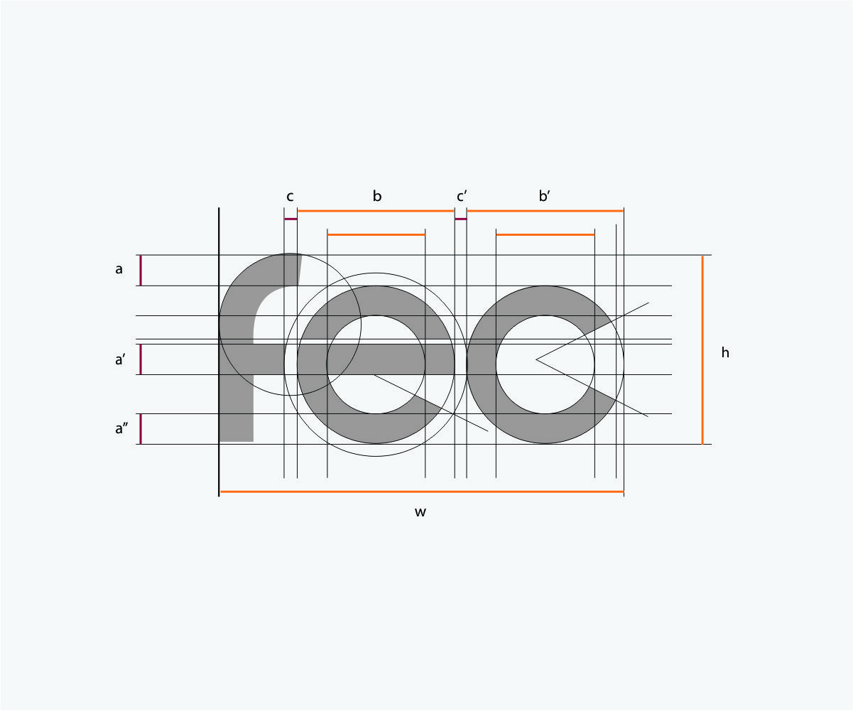
Logo of FEC stands for Family English Center. The FEC logo uses a lowercase font with round and clear strokes, giving the logo a sympathetic and friendly look.
The highlight of the logo is the letter e (english)(education) stylized in bright orange-yellow sun and energy, representing the training goals of the FEC as always towards focus, quality, and a bright future for learners.
The goal is to help students develop comprehensively in terms of knowledge, personality and necessary life skills, applicable to study, work and life; building a dynamic, professional learning environment, where students and parents receive the most sincere care.